Tuesday, February 23, 2010

Art: Fantastic Phrenology - Trolls

Of all the commonly appearing fantasy races, trolls seem to be the most varied and divergent - even within their own realities. I endeavored to record the features of the 'basic' troll present in each.

In case you were wondering (and how could you not?) This series of sketches is being recorded in a 3.5" x 5.5" Moleskine Pocket Sketchbook, using a Pilot Better extra fine retractable ballpoint pen (black ink). There are no preliminary sketches or pencil roughs - good or bad, everything is presented as it was put down in a single pass.

Dungeons & Dragons (Monster Manual I, 4th ed.)
The face of a troll is dominated by its long, pointed nose. The mouth is wide and filled with relatively small - albeit sharp - teeth. Proportionately small, the pointed ears sweep back and out, and have a tendency to droop. An unkempt mane of greasy black hair is not uncommon in the species, though it does not appear to grow anywhere else on the body in any significant amount. The spine connects to the skull further back than in the more civilized races - a trait more commonly seen in lower order carnivores. Consequently, the overall posture takes on a slouched appearance, with the head thrust forward.


World of Warcraft
Like the goblins of the Warcraft world, trolls have large ears and long pointed noses. The former being more swept back and the later being thinner and only slightly more in proportion to the face than their smaller Horde-mates. Additionally, their facial structure tends to be longer and generally more narrow, in proportion. However, it would appear that the defining feature among trolls in this reality are the two large tusks that grow down and curve up out of their mouths. Hair may be present on the face and head, and tends to be a warm, bright color of a contrasting nature to that of their cool-hued skin.


Warhamer Fantasy Battle (7th ed.)
Most animalistic of the specimens observed, the Warhammer troll has thick, mottled skin bordering on the verge of being reptilian in nature. Indeed, the regenerative properties of the troll are not unlike those observed among reptiles and amphibians - though that topic extends beyond a casual taxonomic discussion such as this. The mouth is large and filled with oversized, misshapen teeth that jut out. The nose is large and flat with small nostrils, and the ears are little more than ragged scraps of flesh that sweep back and sag downward. The rearward connection of the skull and spine that is present in the D&D troll is even more pronounced in this specimen, exacerbating the hunched appearance.

Art: Fantastic Phrenology - Orcs

I am noticing an interesting phenomenon as I make these sketches - when I hate the profile, I am usually okay with how the mug shot looks; conversely, when I like the profile, the mug shot tends to be disappointing. I guess that's better than flat out hating both of them, right?

Dungeons & Dragons (4e Monster Manual I)
In comparing the realities, the Orcs of the D&D world appear the most simian in nature. A sloping brow leads down to a flat, upturned snout; which in turn follows a slightly convex upper perioral region to a powerful lower jaw dominated by two tusks. The ears are proportionally small to the head and situated slightly lower than other humanoids. The body is covered in a layer of short but dense hair, usually of a dull gray hue. A subtle brown or greenish tint may be present in the hide.

World of Warcraft
Like their D&D relatives, the Warcraft Orc is defined by his powerful lower jaw and the enlarged canines that protrude from it. The ears are large, pointed, and generally sweep back and slightly out from the skull. The brow and nose are most akin to humans, as are the areas and frequency of hair appearing on the head.

Warhammer Fantasy Battle (7th ed.)
The Warhammer orc has a thick, protruding brow shading beady eyes and an upturned snub nose that crown a disproportionately large upper-perioral region. A powerful lower jaw frames a large mouth in which teeth rapidly grow long and large enough to protrude at random from the lips. The pointed ears are not oversized, but do stick out more so than in the other realities. Warhammer orcs are naturally hairless. It is not unusual, however, to see an orc adorn its head with a pelt, tail or other hair-bearing accessory - usually taken by force from the original owner.

Monday, February 22, 2010

DnD, Art: Shayakand Campaign Map for NMP

Just completed for Nevermet Press, a campaign map for the upcoming Shayakand setting:

Hope it's okay to post this . . .

Wednesday, February 17, 2010

Art: Fantastic Phrenology - Goblins

Phrenology (noun) - The study of the shape and protuberances of the skull, based on the now discredited belief that they reveal character and mental capacity.
-The American Heritage® Dictionary of the English Language, Fourth Edition
Copyright © 2009 by Houghton Mifflin Company.

Fantastic Phrenology (noun) - The comparison of the shape and protuberances of a given fictional race appearing across a spectrum of fantasy realities, communicated via a collection of casual observations and rough sketches.
- The Kingworks Creative Blog, 2010

Dungeon & Dragons (4th ed. Monster Manual I)
D&D goblins are the most individually varied, but still maintain a few common traits among their kind: A wide protruding forehead with a thick brow overshadowing the eyes; a small upturned nose; pointed ears swept back at roughly 45° angle from the skull. Small, mishapen teeth that are less sharp than they are broken and poorly cared for. These goblins have the most hair (usually greasy and unkempt) and the widest range of skin tones and texture (often mottled).

World of Warcraft
The goblins of the Warcraft world all appear to have pointed ears that sweep out to the sides of the skull and a long pointed nose, both oversized in relation to the rest of the head. The chin descends to a point and the lips are well defined. These features appear softer and more rounded on the females. Males typically have a shock of hair sprouting towards the back of the skull in a variety of colors - whether the colors are natural or not, this observer could not discern. The skin is almost always green, with males being a few shades darker than females. Of the goblins, the Warcraft goblin appears to have the largest eyes.

Warhammer Fantasy Battle (7th edition)
The face of the Warhammer goblin is dominated by a thick, fleshy nose. It has bhe most well-defined jawline of the goblins and it's ears, while not as large as the Warcraft goblin in proportion to its head, stick out to the side in a similar fashion. While the braincase is the smallest of the three, its teeth are the largest. The eyes are small and deep-set under a thick brow. The Warhammer goblin is always some shade of green and naturally hairless.

Friday, February 12, 2010

40K: Removing Super Glue from Models - Epilogue

I tried soaking the model in warm water, as suggested on the super glue manufacturer's website. No luck - either the water couldn't get to the bond, or the magnet was just wedged to tightly into the torso that it would not come out.

At this point, I decided to do something drastic:

Since I had not glued the front of the torso on the model, I was able to use a wire-gauge pin vise and drill in behind the magnet - pushing it out.

It turns out that that particular setting was simply wedged in too tight. Even when I went to re-glue the magnet in correctly, I had to use a bit more pressure to get it back into the hole.

I guess the lesson here is to always give yourself at least a tiny bit of wiggle room. It makes things easier to work with. Well, that and rubbing alcohol seems to work for removing super glue bonds between metal and plastic.

40K: Removing Super Glue From Models - Part 2

If you need to get caught up, check out Part 1.

In this experiment, I will be using the plastic Ork Nobz box set which have had magnets super glued into them using Duro super glue.

Method 1: Rubbing Alcohol

I poured some rubbing alcohol into a old glass baby-food jar that I sometimes use to clean my brushes as I paint. Not sure of the alcohol's affect on the plastic, I broke off a small bit of extra sprue and left it sitting in the liquid for about an hour. It is highly suggested that you cover the container, to keep fumes from spreading. I don't have a lid for this jar, so I used saran wrap and a rubber band.

The test bit of sprue did not seem to have any sort of deformation or softening as a result of being in the alcohol, so I went ahead and dropped in the two arms and Nob torso (already glued to a base) into which the magnets had been glued backwards from the others. The jar was then left to sit out of reach of little hands for about 24 hours.

The next evening, took the bits out of the jar with a pair of tweezers, and dabbed them with a paper towel. I was shocked to discover one of the magnets from the torso just fell right out! The two magnets in the arms came out, but required some work with my Xacto knife. I slid the blade into the narrow gaps around the magnet and wiggled it a bit. Eventually, they too came free.

Unfortunately, the other magnet in the torso was still glued firmly in place. There was no room around this last remaining magnet to slide the blade in without damaging or cutting away at the plastic around it. Since I needed the area to stay intact in order to re-glue the magnet in properly, I opted to move on to the next method.

Result: 3 of 4 magnets removed

Why (I think) it worked

Assuming there were pockets of moisture trapped in and around the super glue bond holding the magnet to the plastic, the alcohol help remove that trapped moisture, leaving behind empty pores in the super glue - weakening it. Thus, less tension was required to break the bond. (I totally pulled that out of my rear, but it sounds good . . . right?)

Method 2: Freezing

Taking the torso into the kitchen, I ran it under the faucet for a couple of minutes, try to ensure that water got into every nook and cranny around the magnet. The model was then placed in the freezer and left for 48 hours - Not because I thought the extra time would matter, I just forgot about it for a day.

Taking the model out, I worked at it a little bit with the X-acto knife and also tried holding other magnets on either side of the embedded magnet. Unfortunately, all I managed to do was hack up the area around the magnet a little and leave a scratch on the magnet itself.

Result: 0 magnets removed

Why it was supposed to work

I actually read this on the messageboard (sorry, don't have the link) where I learned about this method - again, this assume moisture is trapped in an around the super glue bond: When water freezes, it expands. The expanding moisture in and around the super glue creates tiny cracks in the bond, weakening it and allowing the bond to be easily broken.

Why it didn't work

Not sure really. Perhaps the alcohol effectively removed what moisture may have been trapped, so there was nothing to expand upon freezing. Perhaps the magnet is set in such a way that there is no space for either liquid - alcohol or water - to penetrate.

What's Next?

According to Loctite's poorly designed website (the makers of the super glue I was using), soaking the bond in warm water might work. There also exists super glue remover, but I'm really only interested in cheap, non-hazardous alternatives.

I would also like to get a new digital camera - one with a working LCD screen, exports directly to my laptop, and doesn't try to cram a ton of noise-producing megapixels through an undersized processor - but that's another rant-er . . . story for another time.

Tuesday, February 9, 2010

40K: Removing Super Glue from Models - Part 1

Bear With Me* for a minute.

It happens to the best of us at some point - and trust me, I am far from the best at any part of this hobby - modelers' regret. You put something together, permanently, in a manner that you wish you could undo. Unfortunately, the nature of modeling almost always means that the parts you stick together are not intended to come apart . . . Well, almost always.

Not so long ago, as I was just getting into this whole blogging 'thang' for myself, I stumbled across an excellent article about magnetizing your models by Master Darksol of All Things 40K.

Months later, I won a box of Ork Nobz on eBay and realized that the time had come. I purchased the same magnets from amazon that Master Darksol used, and eagerly set to work magnetizing my Nobz (which I was hoping to get written up before now, but life has a way of dictating what gets posted and when).

It didn't take long to realize I screwed up.

I started putting magnets in the torsos, then the arms. Unfortunately, despite my efforts to prevent just such an occurrence from . . . occurring . . . one of the torsos and a set of arms were glued in backwards from the others.

So, after offering the requisite amount of cursing and lamentation to Anoia**, I started Googling ways to dissolve super glue. I came across two fairly simple methods: Rubbing Alcohol and Freezing.

Stay tuned as I try both methods and analyze, in my own special*** way, the results.


* Pretty sure I'm 1/64th Cherokee.
** Everyone is a follower, whether you know it or not.
*** IE: completely subjective and uninformed
**** I'm really jonesing for some Pratchett

Friday, February 5, 2010

DnD, Art: Card Game Preview - King

Got another preview for you from the card deck/game I'm developing. For the king, I used the knight as a template and tweaked it a bit, figuring that king would be similarly arrayed for battle as his knights.


The remaining cards will have to be built from scratch. But before I get to them, I need to finish a campaign map for an upcoming Nevermet Press release.

Thursday, January 28, 2010

DnD, Art: Custom Player Icons for My Wave RPG

I've been running a D&D campaign on Google Wave (NMP wRPG 1 - check us out!) for a little while now. There are a couple of cool plug-ins ('gadgets' in Wave terminology) to enhance the experience. The two I rely on are a dice-roller and a battlemap interface called Fighty, which basically takes an uploaded map and puts it into a Google Map interface that can be interacted with in Google Wave.

Fighty made the encounter possible, but things got a bit confusing since there was only one icon available to use for all the PC's and enemies. Then, an enterprising user took Fighty and added some really cool features like uploadable custom icons, different icon sizes, and polygons (which are great for showing auras). This upgraded gadget was called Fighty+, but the additions are supposed to be pushed back into Fighty, if they haven't already been.

The challenge, then, became to find some icons that were attractive and accurate in their representation of the PC's in our game. Alas, the ones that were attractive were not accurate, and the ones that were accurate were not attractive. So I decided to make my own:


Listed in the numbered order presented above are:
  1. Theren - Elf Ranger
  2. Shyaan Kin - Dwarf Cleric
  3. Zelt - Human Druid
  4. Lun'ka - Kobold Warlock
  5. Lii-Ug - Dragonborn Paladin
  6. Akalia - Dragonborn Bard
I used a couple of the SD sprites from the PSP version of Final Fantasy as a basis for the style and anatomical proportions, scaled them down to 30 x 30 pixels which Fighty (Google Maps?) uses for its icons and then painted over them in Photoshop. I tried to be accurate in the weapons and armor presented, but also use the colors that the players identify themselves with in the wave.

Future plans for the campaign include an entry on Obsidian Portal, whenever I get around to it.

Tuesday, January 26, 2010

DnD, Art: Card Game Preview - Knight

Okay, I'm really excited and just a tad paranoid to be sharing this. Here is the first image from a card game I'm developing. Unfortunately, I can't really say too much about it until things are a bit closer to completion.


By the way, if anyone has any experience with print-on-demand (POD) services - particularly involving board and card games - I'd really like to hear about it. So far, my Google-fu has turned up two likely candidates: Guild of Blades, which has (I think) been around for a while; and what appears to be a newer site, The Game Crafter, which has the added benefit of actually selling the game once it's finished.

Monday, January 18, 2010

DnD: Lava Dungeon Tiles

I whipped these up for Newbie DM after a comment he made about a lack of lava-based tiles. Just print these off, then cut and assemble the stone tiles so the non-elementals will have something to stand on. Borders are provided to give a slightly more natural transition between safety and instant death.

They are 300 dpi print-quality. The squares are the standard 1" that Dungeon Tiles use, so they'll work with your minis.

Get the images here (5.7 MB .zip, Medifire)


Feedback and suggestions on other useful sets/textures are welcome.

Enjoy!

Thursday, January 7, 2010

Early Riser: Day 1 - The Best Laid Plans . . .

It's not going to work. And not for the reason you might think.

Here's how things played out:

10:00 pm: Head upstairs, brush teeth; spend about 30 minutes reading Seige #1/admiring Copiel's art
10:45 pm - 12:30 am: Drift in and out of sleep (nervous about getting up early?)
5:30 - 6:00 am: Got up at the radio alarm - no problems here; head downstairs to work out
6:00 - 6:30 am: Nice hot shower, brush teeth, get half-dressed
6:30 - 7:00 am: the kids are awake and want attention; I get their breakfast
7:00-7:30 am: Wife gets up, grabs her shower; I finish getting dressed and shave (a mid-week rarity under normal circumstances)

7:30 - 7:45 am: Grab stuff for lunch, hug wife & kids, leave for work

I was already a firm believer - and have now been convinced entirely - that if a person hopes to be a creative professional, any progress they have not taken towards that life goal becomes exponentially harder once you have kids.

Reflecting on the morning's events, I have come to believe that, while the exercise and waking up at a pre-determined time are beneficial, the 6:30 - 7:30 am hour is probably not going to work as my Golden Hour. Being more naturally inclined to the evening hours, perhaps I could shift things a half hour toward the evening, making a revised schedule look more like:

6:00 - 6:30 am: Wake up, work out
6:30 - 7:00 am: Shower, get dressed
7:00 - 7:30 am: Help get kids ready while wife gets ready for work
7:30 - 7:45 am: Pack lunch and leave for work
8:00 am - 5:00 pm: Work
5:15 - 8:00 pm: Dinner & family time, get kids in bed
8:00 - 9:30 pm: Freelance & personal projects (TV okay)
9:30 - 10:29 pm: Dedicated art time (limit TV, none after 10:00); will have to learn to listen to The Office, and not simply sit there watching it (Shame it doesn't come on before Parks & Rec. - bleh)
10:30 pm: Bedtime


If you're wondering why I'm keeping the amount of time spent sleeping to around 7.5 hours (and why wouldn't you?), it all has to do with sleep cycles. A complete sleep cycle - one that involves all 5 stages of sleep - takes an average of 90 to 110 minutes for an adult. What I've been doing for a while now is calculating the amount of sleep I need/get in 90 minute intervals.

So we'll try this evening and tomorrow morning using the revised schedule and see how that plays out. Hopefully it won't take too much tweaking to hit on a rhythm for maximum productivity & creativity.

Wednesday, January 6, 2010

Misc: In Pursuit of Creativity and Productivity

Okay, first of, this is NOT a New Year's resolution. I've been reading various and sundry articles and blog postings about managing life and being focused and staying creative - enough to know it's a sign.

I'm going to attempt a moderate shift in my lifestyle.

The goal is to see if a few extra hours at the beginning of the day are better for productivity and creativity than those last few extra late hours I always seem to spend staring blankly at the monitor or flipping through the few channels we get, disgusted at the lack of interesting programs.

My current average routine looks something like this:
  • 7:15-30 am: Reluctantly get up, slowly help get the kids dressed, get a shower, go to work
  • 8:05 - 8:15 am: Arrive at work (I'm supposed to be there at 8:00)
  • Work 'till 5:00 pm - not much I can do here
  • 5:15 pm: Arrive home (5:30 if I stop at the game store, 6:00 if I go to the comic book store), eat dinner with the family
  • 6:00 - 7:00 pm: Kids run wild, usually try to get a load of dishes, pick up toys; sometimes we'll go out to eat or need to pick up something from the store
  • 7:15-30 pm: Get kids ready for bed, tuck 'em in (occasionally they'll be up 'till 8, rarely later)
  • 7:30-10:00: Wife and usually I do personal stuff - pay bills, freelance work, paint 40K, WiiFit, Facebook (her, not me), sometimes art - often on the couch while watching TV together
  • 10:00-???: I continue to work on personal stuff and/or play games while the wife goes to bed. If I don't build up some momentum on a project by this point, it's hopeless and I'll turn to video games. Nothing worthwhile on TV at this point.
  • 12:00 am: Bedtime, usually - not unusual for it to be later.
Here is the proposed change:
  • 5:30 am: Wake up, go downstairs and do WiiFit for 30 min. (seriously)
  • 6:00 am: Shower, get dressed for work
  • 6:30 am: Dedicated art time - probably start out doing digital speedpaints - go from there
  • 7:00 am: Kids are up, getting them ready for school, wife gets ready for work - I may find a little extra personal time once they're out the door - but I definitely need to be on the road no later than 7:45 am
  • 8:00 am - 9:59 pm: Keep it the same for now, maybe try to structure evenings better
  • 10:00 pm: Bedtime, no if's, and's, or but's
Possible issues:
  • Coordinating new routine with the wife's-get-up-and-shower time
  • Making sure not to snack or have caffeine after . . . 7:00 pm (?). Don't wanna be lying awake after 10 pm.
  • May need some additional structuring after the kids are in bed.
  • Getting up and going to bed the first couple of days is going to be a challenge.
One of the tips I picked up somewhere had to do with stating your intent - making it public. The idea is that once it's out there, a person is more inclined to stick with it.

So congratulations, you've just been incorporated into my scheme to become more creative and productive.

Ultimately, I hope that this will lead to more posts on here. But let's just take it one day at a time, okay?

Tuesday, December 22, 2009

Dnd, Art, Design: Dwarven Rune Font

Remember the Binary Runes I was working on for one of my Nevermet Press submissions? I used fontcapture.com to turn it into a TrueType file.

The resolution in the final product was not quite as precise as I'd hoped, so I had to remove the binary aspect from the upright portion of the characters, as it came out rather 'blobby.' Still, I think it works rather nicely without it:


Just download it and drop it into your Windows/Fonts folder (Mac OS X: Double-click on the downloaded font file, then click Install Font.)

Dwarven Runes Font (14.34 KB, Mediafire)

This font is 100% free and my Christmas gift to you. I just ask that you give credit where it's due - of course, any and all donations will be greatly appreciated and go towards producing more and better material.

Enjoy!

Thursday, December 17, 2009

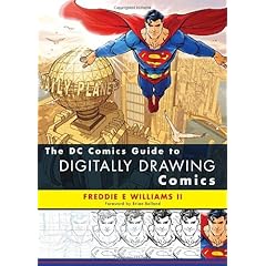
Art: DC Comics Guide to Digitally Drawing Comics Review

My art library is relatively small, but steadily growing. I have found that the books I end up with tend to fall into one of two categories: inspirational and instructional.

The inspirational books are primarily collections of art work, though some 'how to' books will fall under this category if I'm kinda into the art, but don't really get anything new or worthwhile from the text. Usually, I'll look through them, taking a mental inventory of what kind of art is to be found, and set them aside until I need a specific type of inspiration. They cover a variety of artistic styles and subject matter, and are themselves subjective to the kind of inspiration they provide.

Lately, though, what I've tried to focus on getting are books of a more technical or instructional nature - titles such as: Scott McCloud's Making Comics, James Gurney's Imaginative Realism, Vol. 1 of the Best of Wizard's How to Draw series, and pretty much anything by Andrew Loomis.
These books go in depth with the processes and methodology of artists I respect and admire. I am happy to add to this list The DC Comics Guide to Digitally Drawing Comics, by Freddie Williams II.

I should make clear, though, that it's not Mr. Williams' style I am such a fan of - despite his obvious ability and DC's stamp of approval. What intrigues me most about his work is his process, and that is the main focus of this book. FWII (if I may be so bold . . . and lazy) does his work entirely in Photoshop.

His process basically breaks down into the following steps:
  1. Load the script for a page and make very rough gestureal sketches for each panel beside the descriptions.
  2. Move/resize the roughs into panels and develop them further on a new layer.
  3. Make thin 'wireframe' inks for each panel - sans any sort of lighting or texture. Strictly structural and provides a groundwork for inking.
  4. Make outlines (contours) of the foreground elements in each panel.
  5. Turn the contours into "cardboard cutouts" that can be repositioned as needed, but block background elements.
  6. Ink and drop in black areas.
FWII (I'm going to make this a 'thing') also provides instruction on how to break out of the process at a couple of points for artists who prefer to do tasks such as penciling or inking the old fashioned way.

Another section I found fascinating (simply because I'd never thought of it before) was on making paths of complex background elements, such as building facades and chest emblems, which could then be stored, reused, and distorted to meet the artists' needs. FWII also makes use of Google Sketchup to build entire cityscapes for his scenes. Since I like playing around with Sketchup, I found this to be a pretty cool idea.

On the downside, if you are at all familiar with Photoshop, at least one or two chapters of the book will be going over the same information about the program that this topic always seems obligated to address. Also, there was some background information about the author and the evolution of his process that was mildly interesting, but certainly not what I was after when I decided to get the book.

Overall, I am very happy I got this book, having devoured it in its entirety in less than half the time it took for my laptop to upgrade Windows 7. I would recommend it to anyone interested in producing comic-style artwork and looking to make at least some part of the process digital.

One last tidbit: I have read, to some extent or other, all of the "DC Comics Guide to" series, and this is the first one I felt compelled to buy.

Monday, December 7, 2009

DnD, Art: Portrait of a Villain - The Desire; On Sale Now!

I am happy to announce that Nevermet Press - the online collaborative group I have been working with for several months now - has released it's first collection of articles in its Portrait of a Villain Series!

In this eBook, you will find the complete back story to Desiree Turpis, also known as The Desire, a calculating Madame who manipulates local nobles and crime lords to serve her own needs.

It is fully-compatible with 4th Edition Dungeons & Dragons.

Along with The Desire's own back story, adventure hooks, goals and motivations, you will also find:

  • Three fully developed, drop-in encounters featuring The Desire
  • Four new organizations to help create a rich campaign setting, complete with stats for each organization's leader and minions
  • The Objects of Desire; a collection of new magical masks for 4E
  • The Sword Sisters; a new 4E Paragon Path for PCs bent on revenge
  • Highcourt, City on the Edge; a fully developed microsetting to help get things started (includes full color map)
  • The Ceremony, a short story where The Desire assassinates a local noble.

All this and dozens of high quality illustrations and maps, over 30 new allies and enemies all for 4th Edition Dungeons & Dragons.

Nevermet Press eBooks offer the following added features:

  1. TWO PDFs in each purchase. The main PDF is brilliant full color landscape, 3-column layout for EASY screen reading. The second PDF is a FREE B&W printer friendly version that includes a portrait 2-column layout, reduced graphics, and wider left margin. The result is a PDF that is easy on your ink/toner and ready to hole punched for your notebook.
  2. Interlinked PDFs with bookmarks and links to www.nevermetpress.com
  3. Full color, beautiful illustrations and maps.
Get it here!

To mark the occasion, here are a couple of illustrations I contributed to the project, in addition to some written content, two encounter maps, and the Highcourt Map featured on this blog a couple of posts back:


Friday, December 4, 2009

DnD: Call for Submissions - Open Game Table II

Howdy! Hope everyone had a nice Thanksgiving- or ideologically equivalent - holiday. I've been ridiculously busy with projects that (hopefully) I'll get to post more about soon. Until then, I have an announcement for all the DnD/RPG readers:

Jonathan Jacobs, mastermind behind The Core Mechanic and one of the founders of Nevermet Press has announced the second volume of the popular Open Game Table for a Summer 2010 release. It will be released simultaneously as an eBook and with retail print distribution via Studio 2 Publishing.

As was done for Volume 1 - the creation of the manuscript is preceeded by two important steps:
1) the assembly of an independent peer review panel (bloggers, game designers, developers, artists, fans all welcome)
2) the recieving of blog post nominations.

The application period for being a peer reviewers closes December 31st, 2009. These individuals will be responsible for reading the entries (not all of them, word count will be spread around) and interacting with Jonathan during the final decision making process. If chosen, your names will be withheld until publication of the book. If you are interested, follow the link for more information and to submit your information:

The submission deadline for nominations of blog posts closes January 15th, 2010. The submission process has been streamlined so that all you need to submit is a valid URL. Up to 5 submissions per form can be accommodated; but there's no limit to how many forms you can send in. The nomination form, and more information, can be found here:
http://rpganthology.wufoo.com/forms/open-game-table-vol-2-blog-post-nomination-form/

I thinking of submitting some stuff, myself - maybe I'll see your stuff there, too!

Friday, November 20, 2009

Art, Dnd: Highcourt Map for NMP

Well, I had intended to do another 40K Battle Report for a game I had last Thursday, but I honestly don't feel like writing it up. So, instead, I'll give you something much more aesthetically appealing (I hope) than a bunch of crappy cell phone pics.

This is a map I made of Highcourt, the setting for Nevermet Press' first .pdf that should go on sale soon. It's the first time I done a map like this, but I look forward to further developing my own variation the process I emulated to produce this piece.

At last count, I think the .pdf going to be 50(!) pages of rockin' content that you can use for/in your RPG campaigns - and that's all based around a single villain/setting. We've got a LOT more coming down the pipe, with plans to produce a printed collection.

I'd be lying if I said I wasn't excited about it.

Sunday, November 15, 2009

40K: Experimenting with Space Hulk Doors

Fear not faithful reader(s?), I have not forsaken the blog! After a rather hectic week and a half, I finally got around to getting a new post together.

The Space Hulk door bases are great for practicing new painting techniques on. Particularly, I wanted to make them look old and rusty - a technique I plan to apply to my Orks, once perfected.

Step 1 (not pictured): Undercoat of Chaos Black (sprayed on)

Step 2: Flat coat of Boltgun Metal

Step 3: Scorched Brown on the sides, corners and recesses - basically anywhere that does not get as much foot traffic on it.

Step 4: Tin Bitz over the Scorched Brown. Don't worry about an even coat or leaving some of the Brown peeking out in places - it's supposed to old and rundown.

Step 5: Here is where the experimentation really come in to play. Not sure which wash would produce the best effect, I tried three: Flesh Wash, Thraka Green, Badab Black. The washes were liberally applied all over the base. In the case of the Flesh Wash, I probably could have done with a little less.

Step 6: After the washes dried, I drybrushed some Boltgun Metal over the base - being mindful to give the more heavily trafficked areas extra attention.

And that is pretty much all there is to it! I put some doors in the bases to see how they looked.
Surprisingly, I discovered that I only had one green door for the whole set, so I probably won't be using Thraka Green on any of the other steps. The Flesh Wash looked good, but was a little too brownish/orange in the final product for an ideal match to the doors - though the yellow doors helped bring it together some. The Badab Black came out the closest to the color of the metal printed on the cards.

For some added immersion, I'm toying with the idea of making plasticard door frames - without the doors in them - that would fit in the bases and represent open doors. But I've got a loooong list of things to finish before I get around to that.

Tuesday, November 3, 2009

DnD: Encounter Quick Reference Sheet

I finally finished (the version of) the Encounter Quick Reference Sheet, which was developed to help make encounter building a little easier:

Download it here (1.94 MB .pdf, Mediafire)

My plans for the future involve redesigning the Monster Card Template, Player Reference Sheet, and the mysterious Group Tracking Sheet to be more printer-friendly and combing them, along with this sheet and the Skill Challenge Tracker into a comprehensive "DM kit" that can be used digitally or as a print out.